Empowering nurses with digital innovation,
Less paperwork, more patient care.
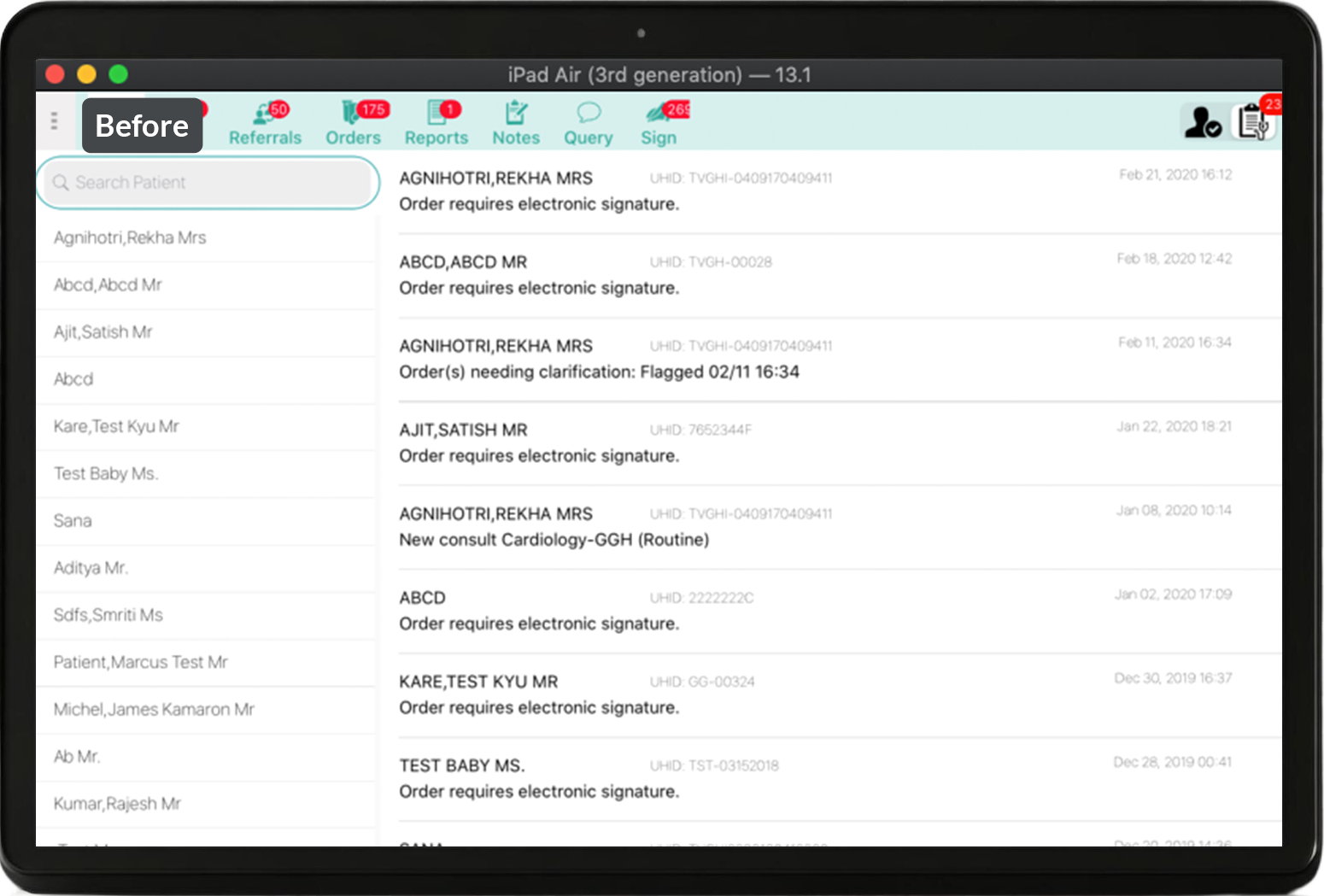
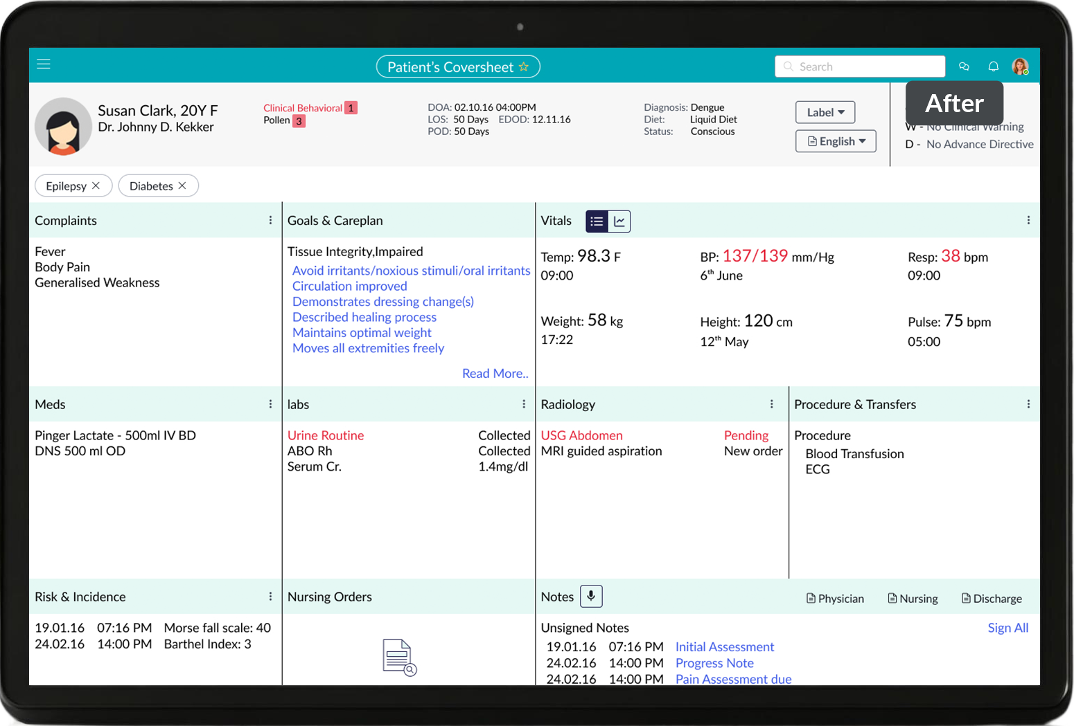


This tool wasn’t designed just to facilitate handoffs, but to support nurses throughout their shift with a centralized patient list, intuitive cover sheets, and a streamlined handoff module, all tailored to their real-world routines.
While I wasn’t embedded with the implementation team post-design, this tool was adopted by multiple hospital systems from high-acuity urban centers to smaller community hospitals. And even though I couldn’t measure precise metrics, the qualitative feedback spoke volumes.
Here’s what we started to hear from the floor:
“This is the first time a handoff tool feels like it was built for us.”
Started as individual contributor ended up expanding the team with 4 designers did user interview, sketching the ideas to wireframes, testing with users and reiterating the design and prototyping. Mentoring the junior designers.
3 Years
"How might we reduce preventable errors through improved cross-shift communication and real-time patient data accessibility?"
During shift handoffs, critical information slips through the cracks.
The result? Stress, repetition, and risk.
What nurses needed wasn’t more data.They needed clarity and a system they could actually trust.

I interviewed 9 nurses of different hierarchy to better understand the problem and discovered key findings and insights that informed my design decisions.
At this stage, I wasn’t chasing features, I was chasing clarity.
Few early interviews with Nurses across different shifts and specialties echoed similar pain points: they were overwhelmed with information, struggling to prioritize, and sceptical of systems that overpromised and underdelivered.
I began sketching concepts rooted in their actual workflows. A few north stars guided my ideation:
✦ Task-focused design: Rather than just showing data, the interface should answer the burning question: “What do I need to act on right now?”
✦ Patient-level summaries with alerts: Not everything needs to be read—but the right things must stand out. Could we surface trends or outliers in a way that’s subtle, yet unmistakable?
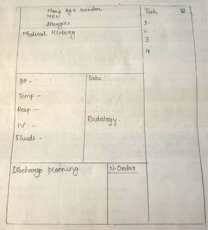
I shared my solution idea at a stakeholder meeting and my they reminded me to use the research insights to make all decisions on what stays and what goes. The SBAR tool would not directly address all the nurses needs, Nurses wanted a broader view, not just a form, so I continued to develop the idea without the SBAR tool.
Design is never a straight line. Each round of feedback exposed new friction points and deeper insights into what nurses actually needed, not just what we thought they did.
✦ "It’s hard to find vitals trends at a glance."
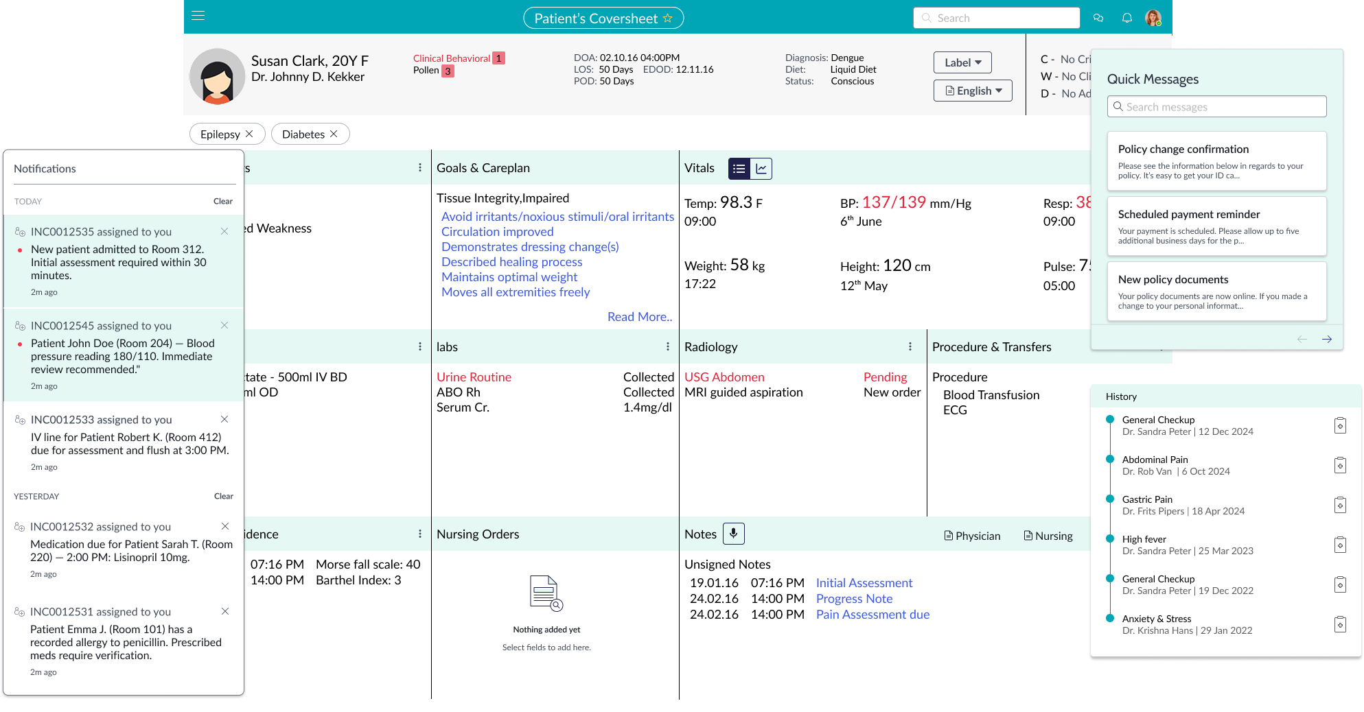
Nurses were scanning dense tables, jumping between tabs, or mentally plotting trends—just to answer a simple question: Is this patient getting better or worse? Our first version presented vitals in a list format: neat, but flat. So we introduced a toggle between list view and mini trend charts, giving nurses the power to switch between raw data and visual patterns—without leaving the screen. This small shift made a big difference. What was once “data buried in numbers” became instantly readable, and even new nurses could quickly spot abnormal trajectories.
✦ "I don’t want to type everything, it takes too long."
Nurses aren’t writers. They’re on their feet, juggling meds, procedures, and conversations. Typing a comprehensive shift note is often the last thing on their mind.
We needed to meet them halfway. So we designed a hybrid input system: Voice-to-text for those quick mid-shift notes
Suddenly, documentation wasn’t a chore—it was just part of the flow.
